Transparent vs White Labels: Which One Should Your Brand Choose
Do you know about the “Shelf Test” where decisions happen in three seconds? If not, then just visualize this scenario, wherein a customer walks into a store. They stop in front of a shelf filled with products that look almost the same in terms of size, ingredients, colors, and pricing. What makes a customer pick one over the other? More often than not, it’s the label. Labels are quiet influencers. They don’t speak, but they guide decisions, and their stakes are rising. The growing demand for labels says a lot about how important labeling has become in packaging and branding. Amid all the variety of labels, two types stand out: transparent labels and white labels. Both work and sell; however, they do very different things. So instead of asking which one looks better, you should focus on which one works better for your product? This post discusses just the same.
Psychology of What You Don’t See vs What You Do
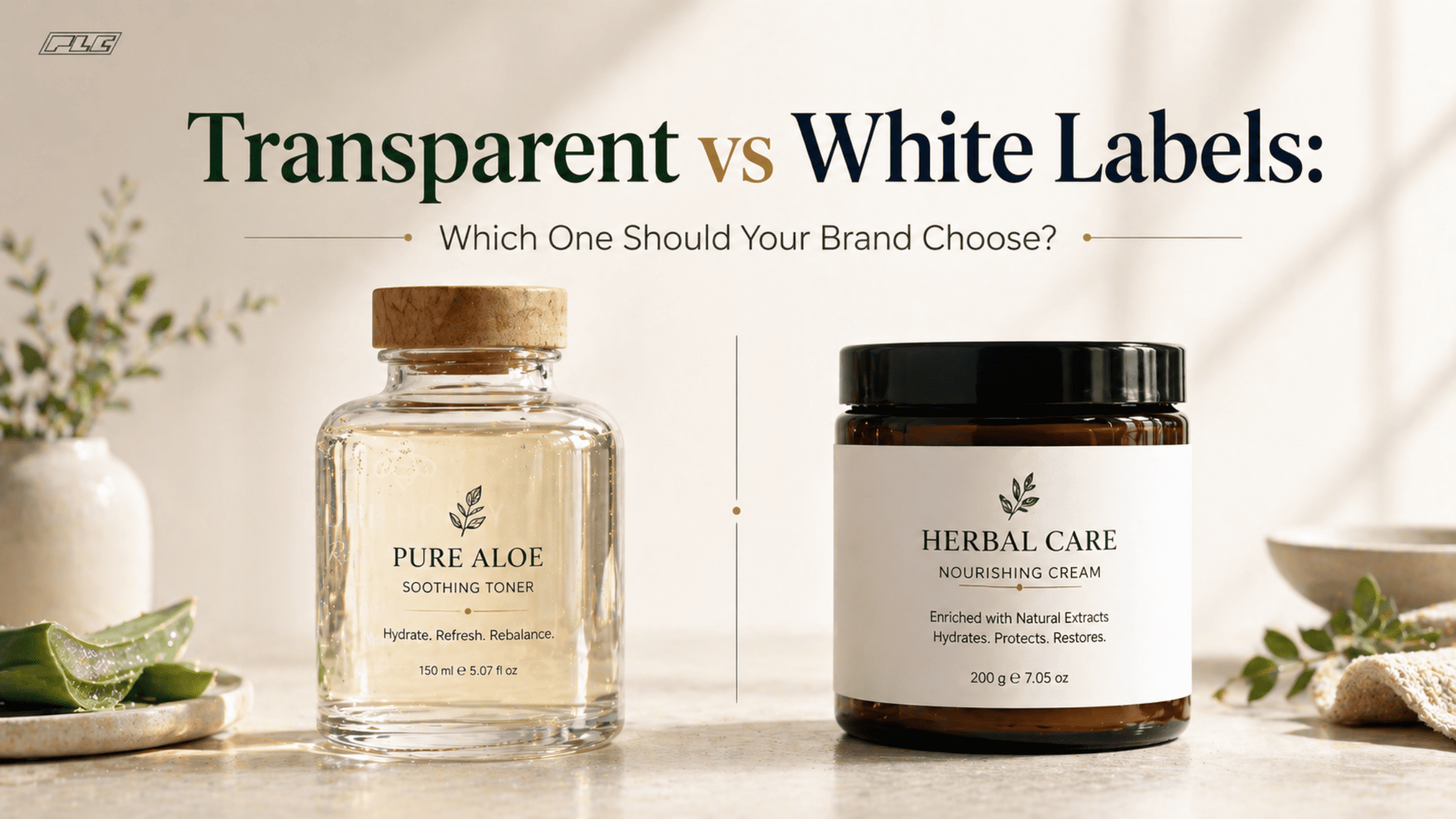
There’s something interesting about transparent product labels.
- They let your product speak first; for instance, highlighting the color of your juice, the texture of your cream, or the clarity of your oil. Both clarity and visibility are part of the pitch
- Transparent labels also create a sense of honesty. What you see is what you get. No distractions. No heavy branding. Just the product in its pure form; clean and intentional.
Now compare that with white labels.
- White labels do the opposite. They frame the product and create a space where your brand can take control. Based on your brand and logo, you can pop the colors and let the text stand out. The messaging becomes crystal clear.
- Customers can quickly read ingredients, benefits, and instructions. This is especially important for food labels and health & beauty labels, where clarity builds trust, and reading ingredients is hugely important.
So, here’s a simple way to think about it.
- Transparent labels tell a product story.
- White labels tell a brand story.
- Neither is better or worse. They just speak differently.
A Market That’s Quietly Shifting
A Labeling game has changed. It’s no longer just about sticking something onto packaging. It’s strategy.
According to a report, the global label market was valued at USD 49.37 Billion in 2026 and is projected to grow at USD 64.26 Billion by 2031 at a CAGR of 5.41% during the forecast period. This market continues to grow steadily, with pressure-sensitive labels accounting for a huge market share of 47.44%. The industry itself reflects that shift which shows a clear demand for flexibility and customization. But the real interesting shift is in the design preferences:
- Minimalist branding is gaining ground. Businesses and individuals prefer clean packaging and less clutter. This is where custom clear labels shine. They blend in and let the product take center stage.
- At the same time, e-commerce is growing. Products are viewed on screens before shelves. That means labels need to communicate quickly, even in small images. This is where white labels hold an advantage. They are easier to read and scan.
- So, the choice between transparent labels and white labels isn’t just visual. It’s shaped by how people shop today.
The Packaging Equation: Your Label is Only Half the Story
Here’s something many brands overlook.
- A label doesn’t exist on its own. Packaging is also an important factor, and rather a gamechanger.
- For instance, there’s a clear glass bottle with a vibrant liquid, such as an orange juice, inside. A transparent label on this bottle would let that color shine through. This is not just a part of the design but a marketing strategy. The product sells itself.
- Now imagine the same label on a plain white plastic bottle. It loses impact and feels incomplete.
- On the other hand, white labels step in when packaging is neutral. Think cardboard boxes or opaque containers that give you a blank canvas to build your brand. Colors, typography, and layout do the heavy lifting.
- So, the decision isn’t just about label type. It’s about how your label and packaging work together.
- If your packaging is the hero, go subtle with transparent product labels.
- If your packaging is simple, let your label carry the story.
The Visibility Paradox: Information vs. Visual Appeal
Clean design looks great; however, it comes with a catch.
- Transparent labels can be tricky as they depend heavily on contrast. If the background interferes with text, readability drops. This is a problem area, especially for food labels where details regarding ingredients and formulations matter a lot.
- You have to think carefully about font color, placement, and spacing. The details must be seen on the label without hiding the product inside.
- White labels are easier in this sense as they create separation. Text sits on a clear background, which makes information easy to scan.
- Here’s the paradox.
- The more invisible your label looks, the more effort it takes to design it well.
- The more visible your label is, the more effectively it communicates.
So, if your product requires detailed information, white labels make life simpler. If your focus is visual appeal, transparent labels can deliver as long as they are made with precision.
Cost Isn’t Just About Printing
At first glance, cost differences seem simple. But there’s more to it.
- Transparent labels usually cost more as the materials used are different. Also, their printing requires more accuracy and the alignment aspect is significant.
- These labels also demand better packaging. Any flaw in the container becomes easily visible. Scratches, bubbles, inconsistencies everything shows. This rectification is an added cost many businesses might not consider.
- White labels, on the other hand, cover all the imperfections. They are quicker to produce and easier to scale.
- So, the real comparison looks like this.
- Transparent labels are an investment in how your product is perceived.
- White labels are an investment in efficiency and consistency.
- If you’re working with large volumes and tight budgets, white labels often make sense. If you’re building a premium experience, transparent labels can justify the extra spend.
Brand Archetypes: Which One Are You?
This is where things get interesting. Your label choice says a lot about your brand, which may sometimes be more than your logo. Let’s look at a few common types.
- The Minimalist Premium Brand
- Think herbal skincare products, organic foods, boutique drinks. These brands rely on aesthetics, clean packaging, and subtle messaging.
- Such brands lean toward custom clear labels and the product becomes the centerpiece.
- The Information-heavy Brand
- This includes packaged foods, supplements, and pharmaceuticals. Here, details regarding ingredients, usage, warnings, and so on are mandatory.
- White labels work better here as they provide clarity and structure.
- The Challenger Brand
- These brands want attention. They want to stand out in crowded categories.
- Here, you’ll often find mix of both styles, such as a transparent base with bold white text or layered designs that combine both approaches.
So before choosing a label, ask yourself what kind of brand are you building?
Hybrid Options: Get the Best of Both
Here’s something many people miss. You don’t always have to choose one over the other.
- Hybrid options: Modern label printing services offer hybrid options, and they’re becoming increasingly popular.
- Partial transparency: This is one approach. Parts of the label are clear, while others are printed in white. This creates contrast without losing the premium feel.
- Layered labels: These labels are clear films with white ink underneath. This allows text to stand out while still showing parts of the product.
- Textured clear films: These are also gaining traction. These labels add a tactile element without making the label feel heavy.
So, if you feel stuck between transparent labels and white labels, there’s a middle ground.
A Practical Decision Framework
Here are all the factors summed up to simplify your decision-making process.
- If your product looks visually appealing and you want customers to see it instantly, go for transparent product labels.
- If your product needs to communicate details clearly, choose white labels.
- If you’re building a premium image, custom clear labels can help.
- If you’re scaling production and need consistency, white labels are more practical.
- If you want flexibility, explore hybrid custom product labels that combine both styles.
- In short, there’s no single right answer. It’s all about the one that fits your product and audience.
Get Customized White or Transparent Labels at PLCTX
A label is often the first interaction someone has with your product. Before they try it, trust it, and recommend it. So, ensure your label builds that trust and says the right thing. Partnering with the right supplier matters here. PLCTX offers custom options and a variety of labels including pressure sensitive ones. Contact their team today to discuss your requirements.